Interactive Flavor Tags, Advanced Search & Filter Concept
The goal of this multi-part project was to leverage the existing flavor point data by adding new native app functionality around it; specifically, creating interactive flavor point tags for users to select when adding a "Taste" and offering flavor note filtering. In the search and filter concept featured here, I took the functionality to the next level with an exclude flavor point filter.

Year: 2021
Tasks: UX/UI, Wire Flows, Visual Design
Tools: Axure
Client: Distiller
Collaborations: CTO, CEO, Developer
Spirit Flavor Points Defined
One of the key features of the Distiller product is a spirits' Flavor Profile graph, comprised of a maximum of 14 flavor points (notes) as detected by expert panel and novice tasters. These static graphs are included on every individual spirit page in the web and native app, providing unique value to the end user who's looking for a new spirit to try.

A New Flavor Profile Display on Native
The flavor profile graph was positioned just below the fold on native and, given its user value, the business wanted prioritize its position. The graph format presentation also needed a rework as it was both tough to read when scaled capped at a maximum display of 14 flavor points. (And we all know that everybody's taste buds are uniquely theirs.)
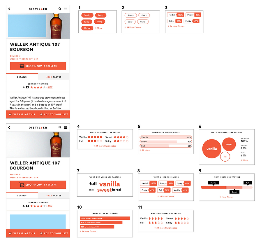
I kicked off the project by exploring new positioning and presentation concepts for the flavor profile with the business ultimately landing on the #9 option below:

Polishing #9, Adding Interaction
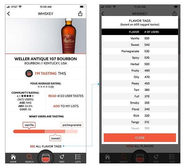
Even though the white on gray text bubbles passed WCAG AA Rating standards, it was hard to read. Plus, the color combination was too harsh for its surroundings. I explored some alternative color combinations, ultimately landing on a stroked version of the bubble design shown below with its connection to the All Flavors modal.
It's important to note here that the modal design and behavior was well established throughout the app, and therefore not open for changes.

Interactive Flavor Tags on "Tastes"
How Distiller defines a taste
"A taste is a personal rating and review of a spirit that you've tried. Adding tastes builds your flavor profile so we can provide targeted spirit recommendations based on your preferences."
At the time, a taste was simply a written review of a spirit. Many users included written flavor notes in their reviews, which were scraped when possible, but this was obviously not the best method for collecting this valuable data.


Don't Make Me Think
Adding interactive flavor tags to the review form would not only ease the task burden for Distiller's users, thus encouraging more completed tastes, it would ultimately provide ongoing benefits to the business with more data collected to parse and represent back to the user in the form of:
-
More accurate spirit flavor profiles, and;
-
A more comprehensive (future) flavor point search.
With the modal design pattern well established throughout the app, the only point of discussion was around priority order of the new components (including a tasting photo upload, not part of this case study). As the interactive flavor tags were top of priority, I positioned directly below the rating selector.
In order to maintain a workable modal height, I allotted two rows for displaying the most commonly tagged flavors. The See More CTA triggered another modal (not the best choice, but system constraints limited exploration of alternative display options) organized by selected tags first, suggested tags second (based on other user's selections for the spirit), and a searchable list of all tags. View flow in Axure

Discovering New Spirits Made Easier
While the business delivered personalized spirit recommendations for members based on previous taste ratings, there was no function for users to search for spirits that contain their preferred flavor notes. So in addition to requesting overall UX / UI improvements to the existing search and filter flow, the business wanted to prioritize a new search and filter by flavor feature.
I worked closely with the CTO throughout the duration of this ideation stage and was provided free range to explore solutions without minding system constraints or resource limitations.
Brainstorming Solutions
I had a few ideas top of mind, including:
-
Categorized autocomplete suggestions on the text input search, and;
-
Multi-category filtering.
Additionally, the CTO wanted to add a standalone flavor search - living outside of the search and filter functions - with high priority visibility.
Categorized Autocomplete Suggestions
Distiller's existing search functioned as a basic search flow whereby users input a search term, clicked the search icon and received a results list based on spirit name match (with some accounting for misspellings). At a minimum, adding autosuggestion match on spirit name would be an improvement.
But beyond spirit name, there were other options to leverage for search input matches including spirit style (i.e. peated blended malt), blog articles and, of course, flavor point. I also recommended adding recent searches, recently viewed spirits when available, and - though not represented in the static image below - trending searches and popular searches to provide new users a starting point.

Flavor Point Filters
The existing filter options were limited to cost, location of origin and spirit family style, icons for which triggered a single category pick list modal:

In one of our brainstorming meetings, the CTO mentioned Musicbed's (newish) addition of an exclude filter whereby a user could define certain music attributes for removal from their search results, and requested that I explore how this technique could work with Distiller's flavor points.
But First, A Little Experiment
I first needed to fully comprehend how the exclude filter would work in practice before putting any time-intensive UX/UI work in, so I ran a quick experiment:
I selected five spirits for the test, designating three example flavor points for each. Next, I created two user scenarios: one in which the user begins the filter process by including certain flavor points and the other in which they begin by excluding flavor points. I then reversed the order of filtering steps in each scenario to prove the theory that users will land on the same results via different paths.

Filter UI Exploration
With the hows of the exclude flavor point filter algorithm fairly well defined, I could move on to exploring some multi-category filtering UI layouts.
One of the outstanding questions at this point in the project was deciding whether or not to offer exclude filtering on style, user rating, and country of origin because these category filters would function differently from the flavor point filter. This is because individual spirits only have one style and one country of origin (this or that), but can have multiple flavor point attributes (this and that). Regardless, we could still offer the user a choice of either include or exclude filtering to achieve their desired results.
The best way to keep the discussion moving forward was to mock up some wire flows containing both include and exclude options on all categories:


I also explored an alternative layout that could minimize accidental taps:

And an option intended to make it clear to the user that the style filter was either include OR exclude:

But at the end of the day, attempts to clarify the exclude filter option on style, user rating and country of origin for the purpose of maintaining a consistent UI were no longer worth it as there just wasn't enough end user value.
It was time to get back to basics: this or that filters would offer include only and the flavor point filter would offer both. I chose conventional controls in the wireframes to show clear intent, with the idea that there was room for more creative control display in the visual design phase.
Note that in the wire flows below, I chose to offer a Select All option for which users could then deselect flavors thus subtly maintaining an exclusion function.

Filter Header Labeling
I explored some alternative labeling options, with Include / Exclude winning out in the end:
Show - Hide
Only Show - Don't Show
Add - Remove
Final Flavor Point Filter Flow
In the final UI, we chose to replace the Select All checkbox with an All Category checkbox selected by default on first view.
Additionally, the radio buttons previously used for the include / exclude flavor selections were replaced with checkboxes containing tick symbols representing include and x-marks representing exclude.

Adding a Paywall and a Splash of Color

Standalone Flavor Search
The final part of the project was to explore strategies for bringing the flavor search front and center as a standalone component outside of the search and filter flow. The business priority for this feature was extremely high given its end user value and paywall restriction, so the first obvious placement choice was the home screen.
Because I was also exploring new home screen designs for the v2 app at the time, there were no existing styles or layouts to conform to, so - as with the search and filter flow - I was given full creative license.
The flavor search tool needed to be engaging, easy to understand, and uncomplicated without sacrificing end user value. Limiting the initial flavor selection tags to the most common in the spirit database (more on that later) kept it simple, while the conversational tone made it engaging and easy to understand:
Home screen

Home screen scrolled

Global Visibility
My first stab at the tool was well received, but the business wanted to explore ways to give it more visibility. Since it was a companion spirit search function to the search input bar and barcode scan, it made sense to offer it in the same vicinity. I chose a drop icon (an element of the Distiller logo) to conserve space:

There was concern expressed that the drop icon wasn't an evident enough representation of its function, so I explored some text based alternatives. The business ultimately landed on the simple v5 option below, a choice I fully agreed with:

Completing the Flow
The tool was intended to direct users to a spirit list where they could further refine their flavor preferences or apply additional style, country of origin or user rating filters:

Leveraging Web Traffic
The spirit detail pages on web are the top entry point, and there were discussions around leveraging this traffic to bring attention to the new flavor search tool which, in turn, could boost Pro subscriptions with a strategically placed paywall restriction. (For example, allow 3 flavor search tool uses as a non Pro member.) At a minimum, there was potential to decrease bounce rate.
Though the idea was solid, the project didn't gain much momentum before it was scrapped. In the mobile web concept below, the interactive flavor tags were given priority visibility above the fold:

Success Metrics
As is par for the course as a UX/UI design contractor, my involvement with a project typically begins at the ideation stage and ends at the developer file handoff stage. In some cases, it can take up to a year or more for a project to launch (or not at all). This is one of those cases where I've not been involved in the development process and therefore am uninformed of the outcome.